A bump bar is an external piece of hardware that allows employees to navigate the Kitchen Display System (KDS) device without using the touchscreen. This is useful when a touchscreen is not in a convenient location (such as placed up high or away from the station), or when dealing with ingredients and equipment (making it difficult to use a touchscreen). Additionally, it provides a more consistent experience for employees who are accustomed to using a bump bar.
Toast KDS devices support specific third-party bump bars. Please refer to the Toast-specific website for ordering the Toast-supported bump bar.
|
Note |
|
The wireless bump bar is in limited release. |
A single bump bar is designed to integrate with one KDS device. The bump bar includes an overlay of the button layout specific for the Toast platform, which is inserted into the bump bar. For more information about which bump bar to use, contact your Toast account representative.
In addition to the specific bump bar and overlay insert, your restaurant must use:
-
New KDS view on your KDS devices. For more information, see New KDS view.
-
The local data synchronization method (otherwise known as offline mode with local sync). Local synchronization allows you to use KDS offline mode in the case of a connection outage. For more information, see Offline mode with local sync.
|
Note |
|
You can still use the KDS device touchscreen while the bump bar is connected. |
You can choose to orient your bump bar either horizontally or vertically, depending what works best for your kitchen. The button overlay included with the bump bar has the horizontal layout printed on one side and the vertical layout printed on the other side, allowing you to change the orientation as needed.
The orientation of the bump bar works independently from the orientation of the KDS device.
When the bump bar is first connected, the setup process guides you through choosing the bump bar orientation. You can change the orientation at any time.
To change the bump bar orientation setting
|
Note |
|
You must use the touchscreen functionality to change the bump bar orientation. |
-
Navigate to the Device Setup screen. You can either:
-
From the Toast POS home screen, navigate to the Setup section and select Device Setup.
-
From the Kitchen Display System mode screen, select the overflow menu (the ⋮ icon) on the top right and select Device Setup.
The Device Setup screen opens.
-
-
Select Bump Bar. The bump bar settings page opens.
-
Select Layout. The bump bar layout setup screen opens.
-
Select either Horizontal layout or Vertical layout.
-
Select Save.
In addition to changing the setting, you must also change the bump bar button overlay insert to make sure it's facing the correct way. The bump bar button overlay insert has the horizontal layout on one side and the vertical layout on the other.
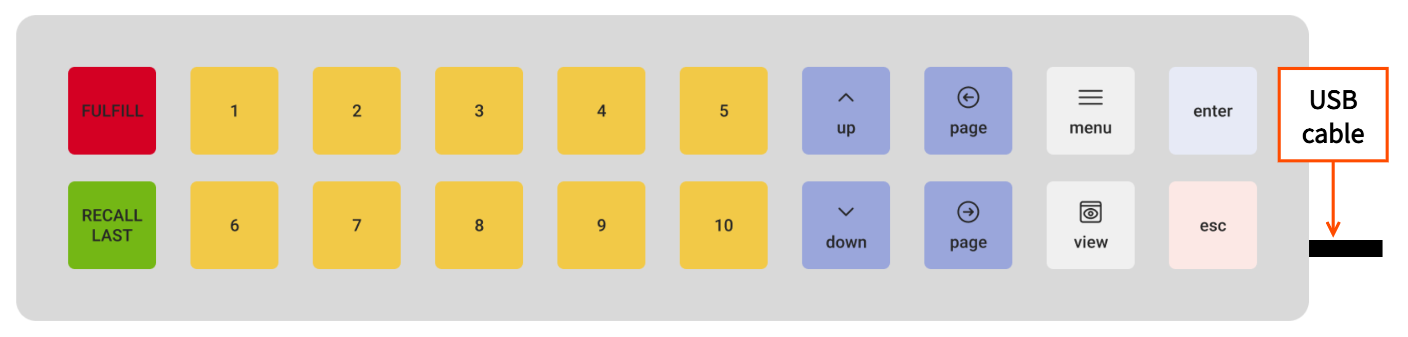
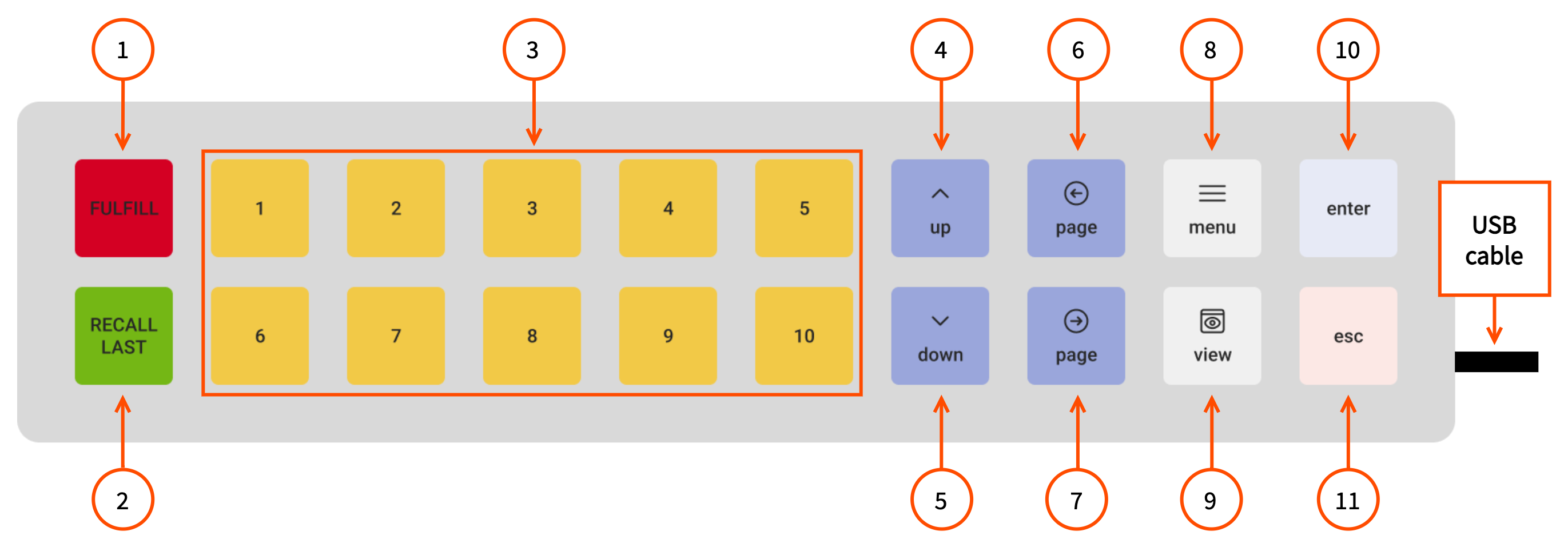
When using the horizontal layout with a bump bar that uses a USB cable, the USB cable connected to the device must be on the right. A bump bar that uses a USB cable does not have a light indicator. Here is an example of a bump bar that uses a USB cable with the bump bar overlay insert for the horizontal layout.
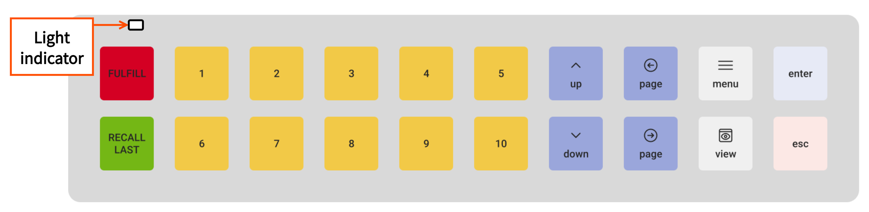
When using the horizontal layout with a wireless bump bar, the light indicator must be on the top left. A wireless bump bar does not have a USB port. Here is an example of a wireless bump bar with the bump bar overlay insert for the horizontal layout.
|
Note |
|
The wireless bump bar is in limited release. |
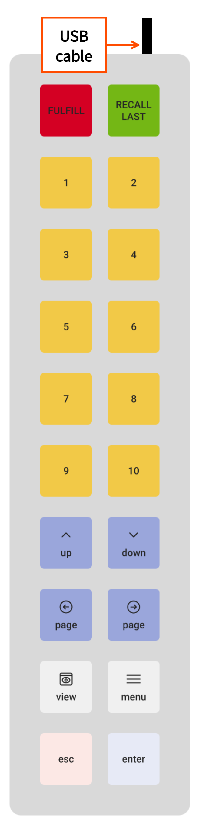
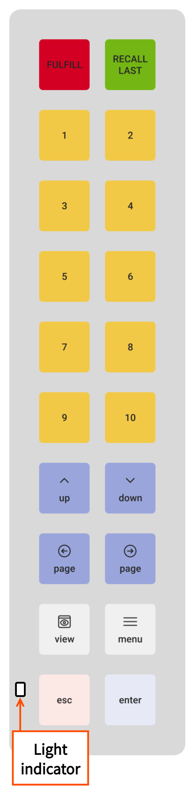
When using the vertical layout with a bump bar that uses a USB cable, the USB cable connected to the device must be on the top. A bump bar that uses a USB cable does not have a light indicator. Here is an example of a bump bar that uses a USB cable with the bump bar overlay insert for the vertical layout.
When using the vertical layout with a wireless bump bar, the light indicator must be on the bottom left. A wireless bump bar does not have a USB port. Here is an example of a wireless bump bar with the bump bar overlay insert for the vertical layout.
|
Note |
|
The wireless bump bar is in limited release. |
For more information on how to set up the bump bar, see Setting up the bump bar.
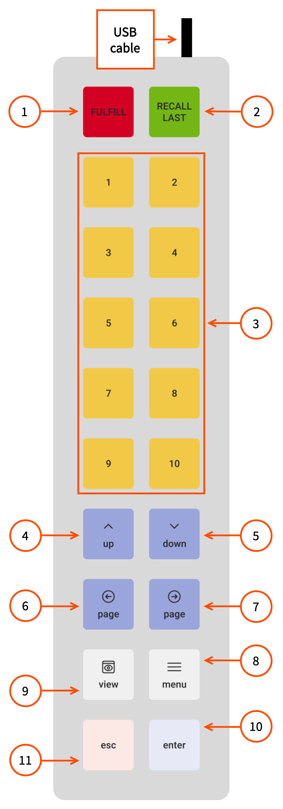
The bump bar uses an overlay insert to label the bump bar buttons, with each button performing a specific action. The following is a diagram of the bump bar horizontal layout with numbers corresponding to descriptions in a list below the diagram.
-
FULFILL: This button fulfills the selected ticket, or the selected and in focus unfulfilled item or items.
Note
Pressing the FULFILL button for fulfilled tickets or items has no effect.
-
RECALL LAST: This button recalls the most recently fulfilled ticket, or the selected and in focus fulfilled item or items.
Note
Pressing the RECALL LAST button for unfulfilled tickets or items has no effect.
-
1-10: The button selects the matching numbered ticket visible on the current page of the KDS device. Pressing the numbered button twice in quick succession fulfills the selected ticket. If fulfilled tickets are shown with the Show recently fulfilled view, the same action unfulfills the selected ticket. For more information about this setting, see KDS interaction options.
-
If a button does not have a corresponding ticket on the page, pressing the button has no effect.
-
These buttons can also be used by an employee to enter their PIN number on the passcode screen, with 10 as the equivalent button for 0.
-
-
up: This button rotates through the options available for selection on the screen.
-
For tickets, the focus navigates from the highest to lowest number. If there are multiple pages of tickets, the focus continues from the highest numbered ticket on the previous page. If there are no previous pages, or a single page, the focus remains on the lowest numbered ticket.
-
For the dialog of a specific ticket, it rotates through the individual items and other buttons.
-
-
down: This button rotates through the options available for selection on the screen.
-
For tickets, the focus navigates from the lowest to highest number. If there are multiple pages of tickets, the focus continues from the lowest numbered ticket on the next page. If there are no next pages, or a single page, the focus remains on the highest numbered ticket.
-
For the dialog of a specific ticket, it rotates between the individual items and other buttons.
-
-
page (arrow pointing left): This button navigates to the previous page of tickets, if available.
-
page (arrow pointing right): This button navigates to the next page of tickets, if available.
-
menu: This button opens available actions for the ticket. Depending on your configuration, these actions can include Rush, Print, Unfulfill, or Ticket Detail.
-
view: This button shows or hides recently fulfilled tickets, depending on whether recently fulfilled tickets are currently hidden or shown.
-
enter: This button's actions depend on your current configuration:
-
If flashing for new tickets is enabled and the ticket is flashing, selecting this button when the ticket is in focus acknowledges the ticket.
-
If flashing for new tickets is not enabled or the ticket is not flashing, selecting this button opens the selected ticket to view individual items and ticket actions. If individual item fulfillment is enabled, selecting enter again while an item is in focus selects the item so you can navigate to the Fulfill option to fulfill specific items.
-
-
esc: This button exits or closes dialogs without applying changes.
Note
There are some dialogs that still require using the touchscreen.
The following is a diagram of the bump bar vertical layout with numbers that correspond to descriptions in the list above.